Overview
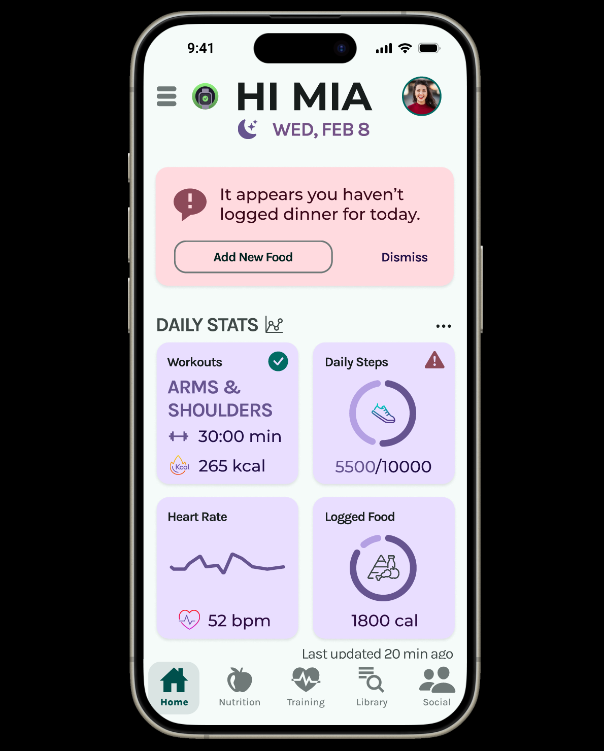
FitQuest is a health and fitness mobile application that provides an all-in-one solution for those interested in incorporating health and fitness into their busy lifestyles. Key features include customized training plans and reminders, personalized goals, nutrition tracking, and educational resources.
Duration
6 months
My Role
Lead UX Designer and Researcher

The Problem
Our health and wellness users need an app with custom plans catered to help them stay on track with their wellness goals because they have busy schedules that make it difficult to keep up with a healthy lifestyle.
The Solution
A mobile application that has custom goals catering to a user’s wellness needs and busy schedule, daily reminders and goal incentives, a place to talk with other users, suggestions and resources related to goals, and portable accessibility for on-the-go tracking.
The Research
The first step to good design is good research. The early phases of FitQuest consisted of data collection and generative research, leading to the development of user personas. First, I conducted a competitive analysis to understand the strengths and opportunities of other health and fitness applications on the market. Findings from the competitive analysis helped structure my research plan and interview script to gain a deeper understanding of which insights my audience wanted from a health and fitness application, what motivates them to reach goals, and the why they would benefit from an application like FitQuest.
Interviews
Three participants, three remote interviews, and one lengthy affinity map.
What did I learn about my audience? Well, to sum it up:
Users want an “all-in-one” application that will do the work for them by providing resources and tips, as well as training, classes, and nutrition plans.
Users prefer having 3rd party integration with fitness trackers to track their data seamlessly.
Users want accessibility and affordability for premium application features. If the cost for premium features is too high for what is provided, users do not want to pay for it.
Users are motivated by external factors and visual representations. They like to be able to see progress visually and have notification reminders.
Users stay motivated when their health and fitness goals are broken down into smaller goals.
Users prefer to incorporate health and fitness as a whole lifestyle change, which includes finding ways to “be active” vs. “exercising”.
Users do not need an extensive list of health and fitness data, but rather a snapshot of their overall health and how it is progressing towards goals.
Personas
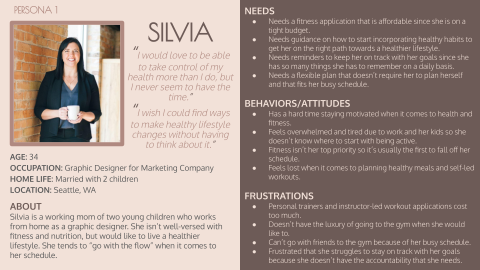
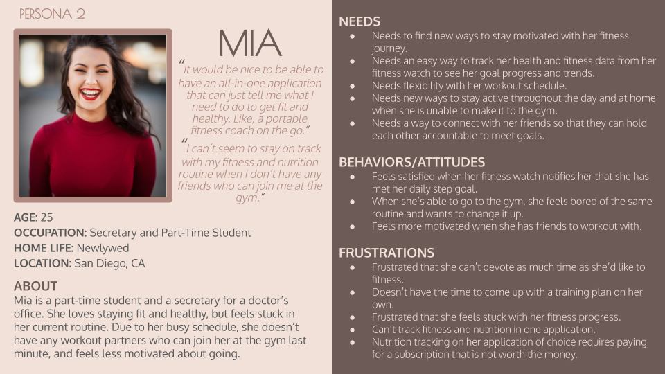
Thus, Silvia and Mia were born.
The Design Process
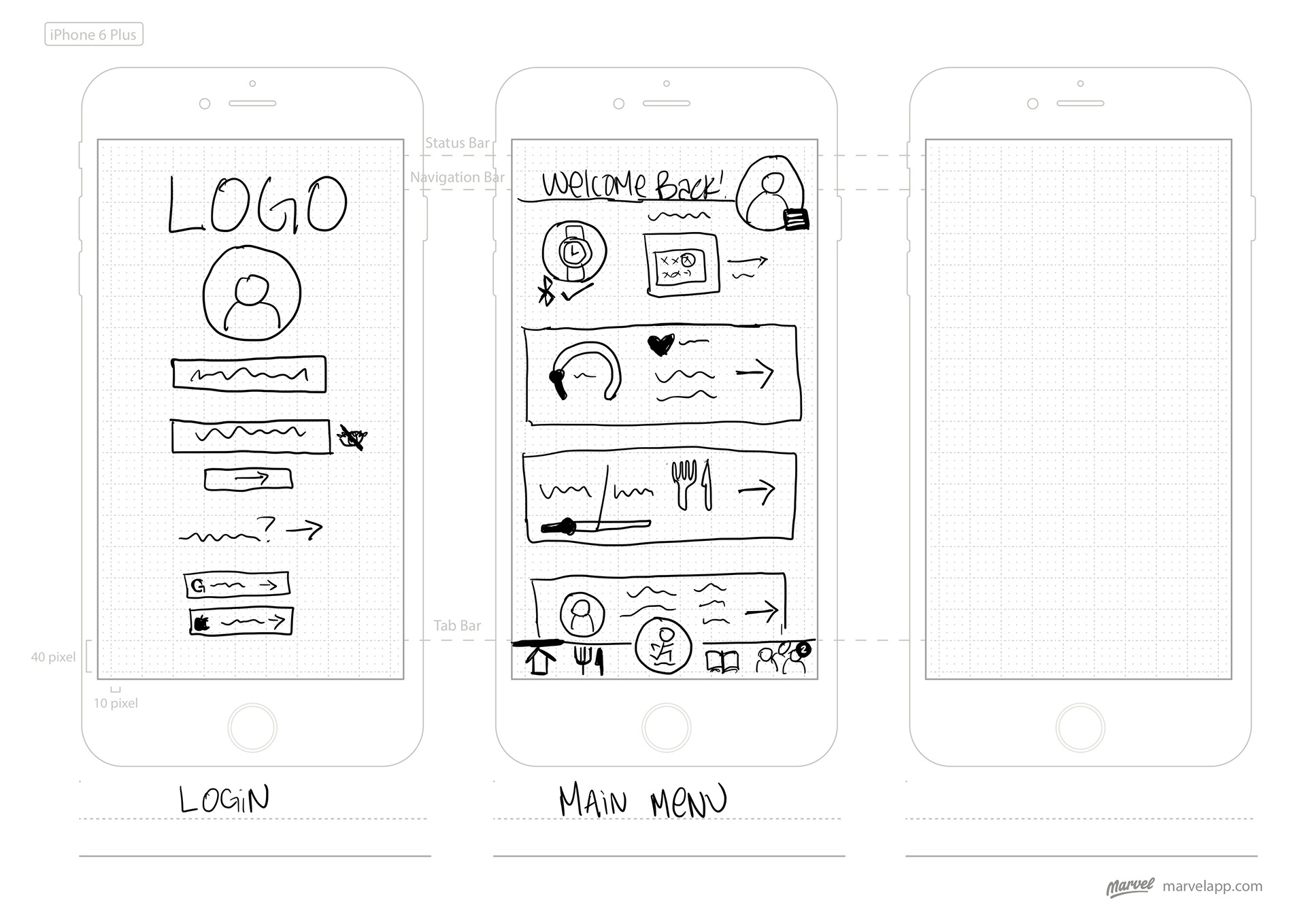
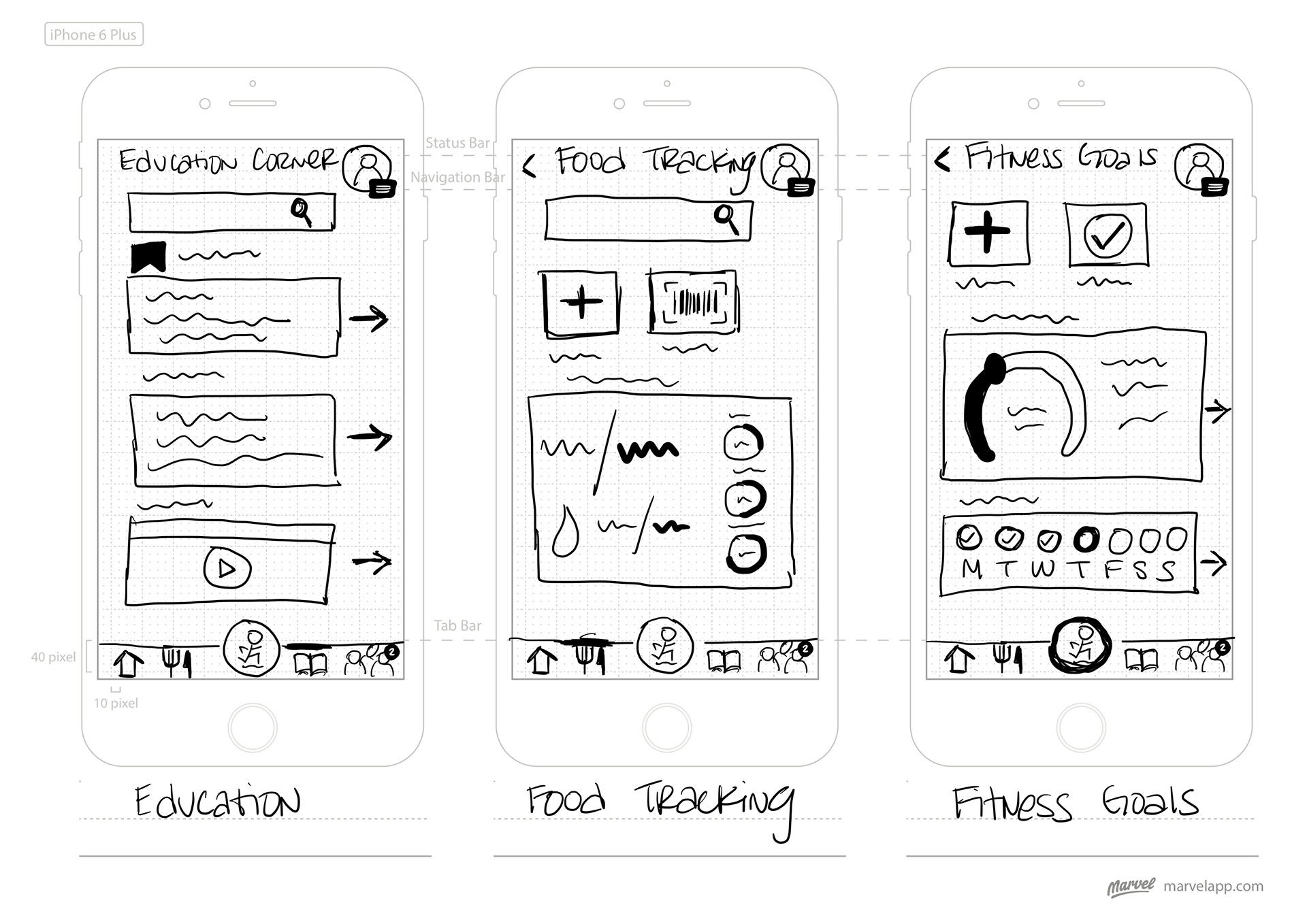
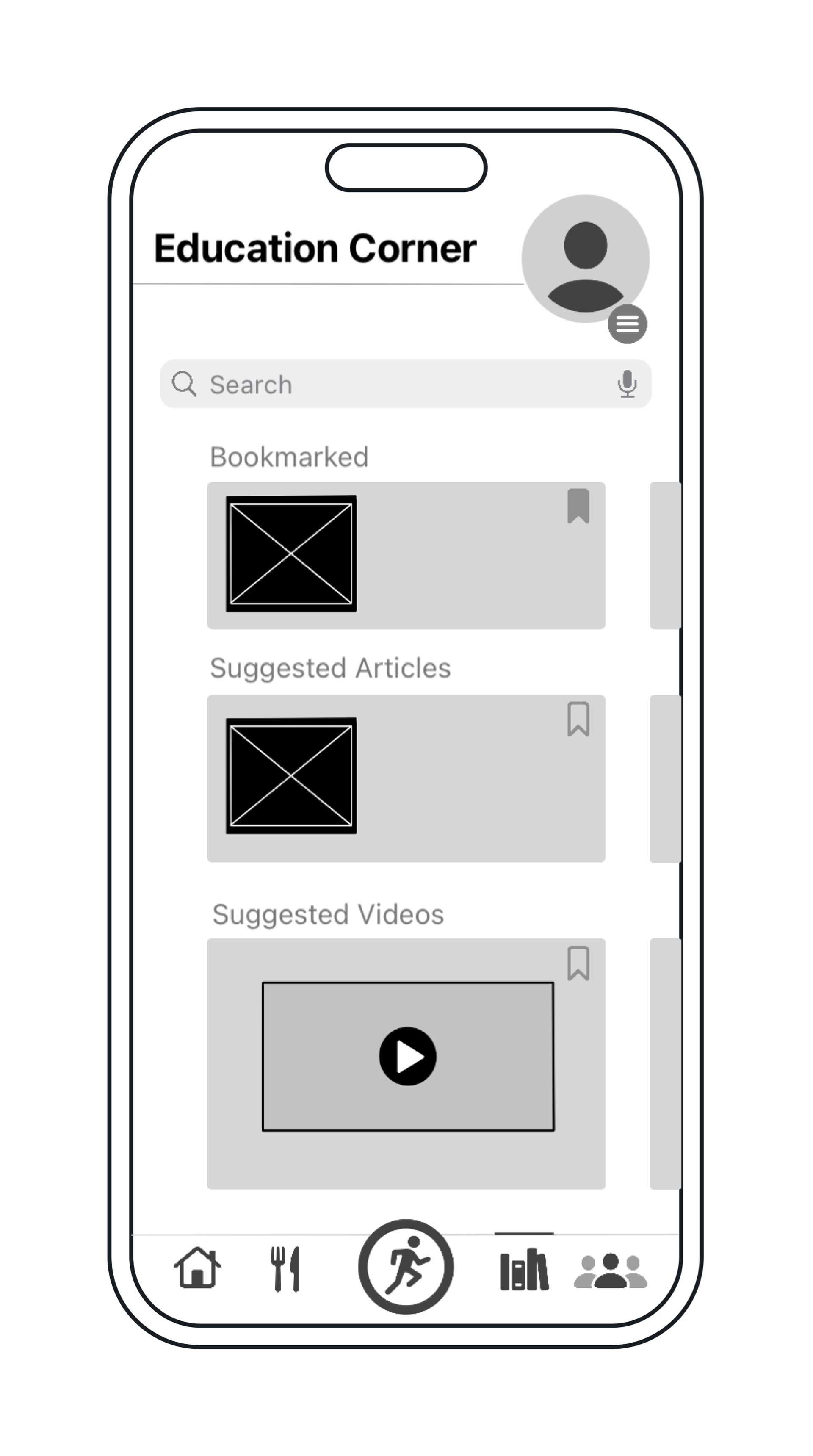
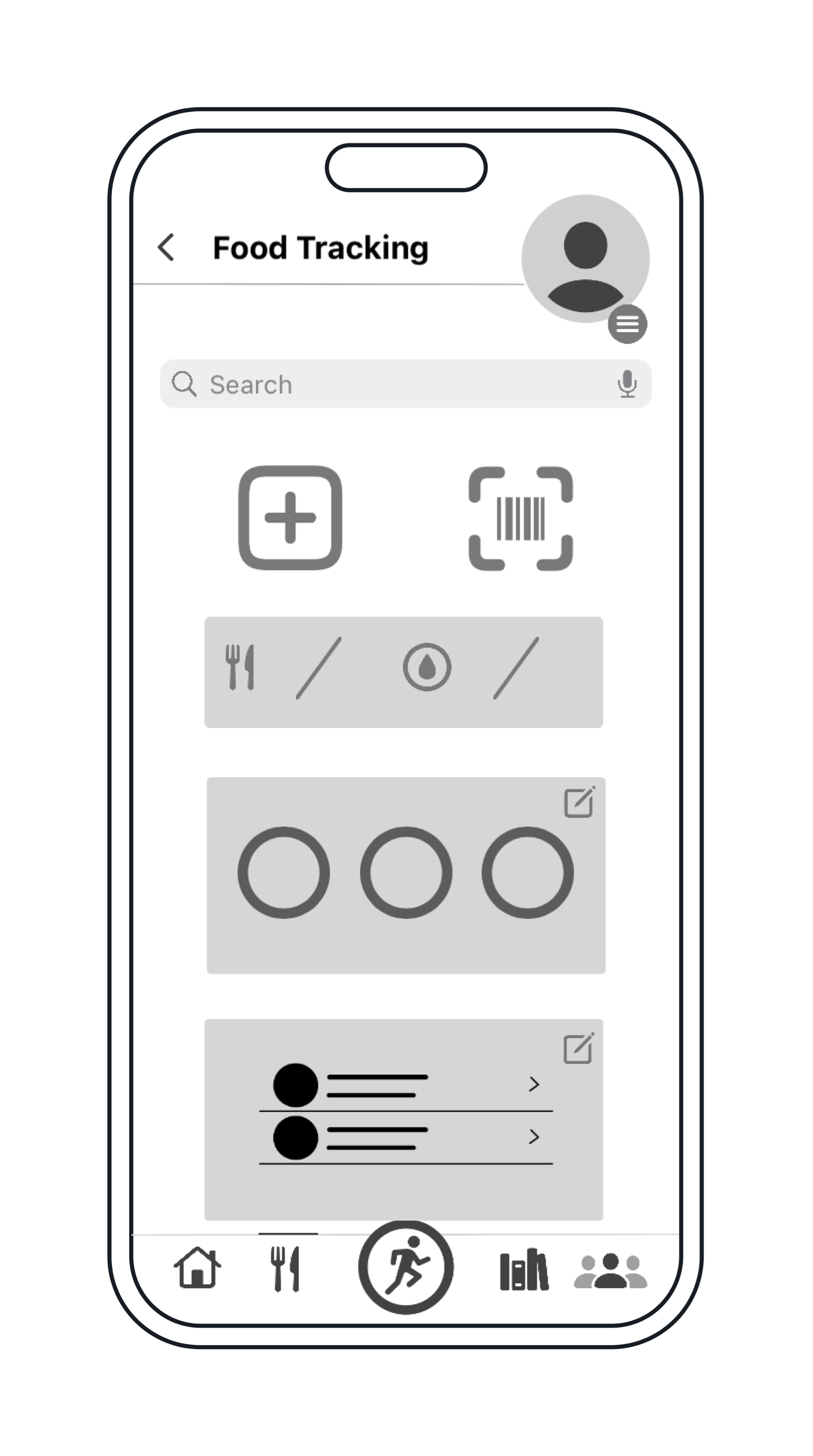
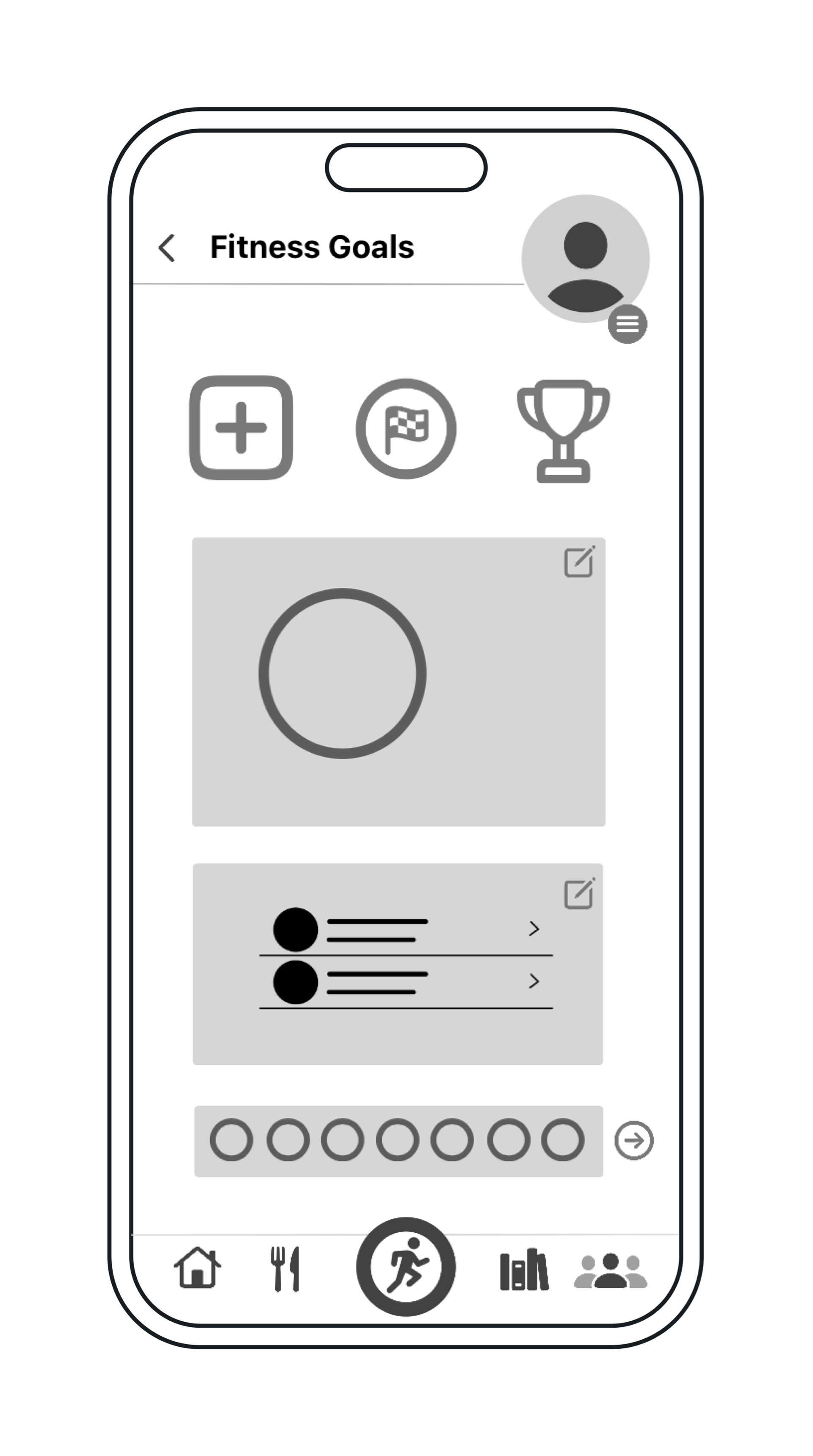
It all started with some simple, low-fidelity wireframes.
Prototyping
From low-fidelity to mid-fidelity wireframes, creating the first round of digital wireframes allowed me to visually map out the features of my application. This was also the phase where I was able to conduct Remote Moderated Usability Tests.
Six participants, six tests, and one (very) lengthy affinity map.
Feedback Implementation
Observations and feedback from the Usability Tests gave insight into obstacles and errors throughout the task flows. What I had assumed to be user-friendly was not as intuitive as it seemed, which led to the first revision of my prototype.
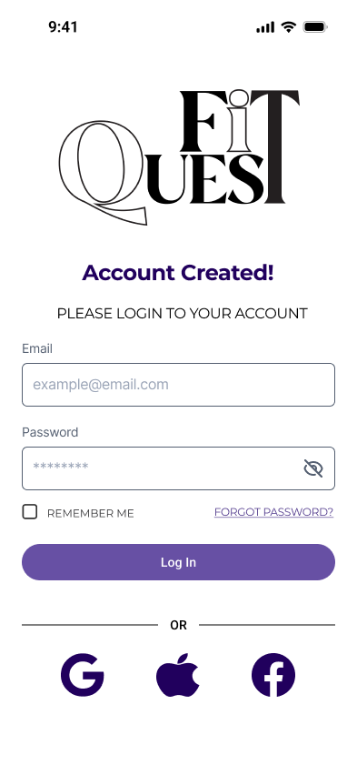
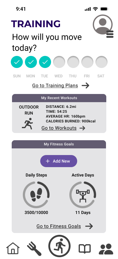
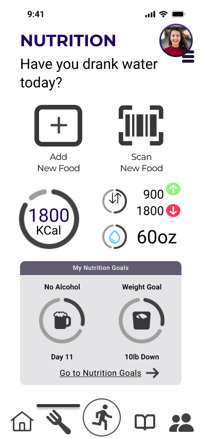
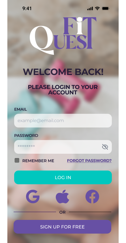
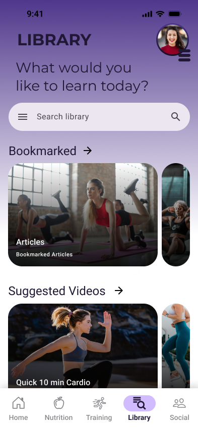
The first three screens below (login, training, and nutrition) are examples of the original version of my prototype. The second three screens (login, splash screen, library) are examples of the first round of revisions.

UI Style Guide
Once I had all the revisions, basic features, and components implemented into my design, I created a style guide that was my primary reference for maintaining consistency across the application.
The Iterations
Accessibility and consistency were the two main reasons for continuously revisiting designs to make improvements. In order to validate the design and UI against business objectives, a series of feedback loops were conducted. Color schemes, typography, and component alignment saw major changes through the evolutionary process.
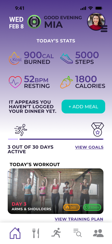
The home screen, pictured on the right, is one example of the drastic changes that were made to the overall UI. The first version (left) did not follow a style guide, while the second version (right) is the iteration that was implemented after the UI style guide was created.
The newest versions of the splash screen, login screen, signup screen, and onboarding screens can be seen below:

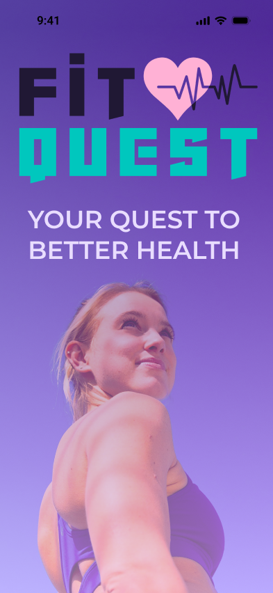
Splash Screen
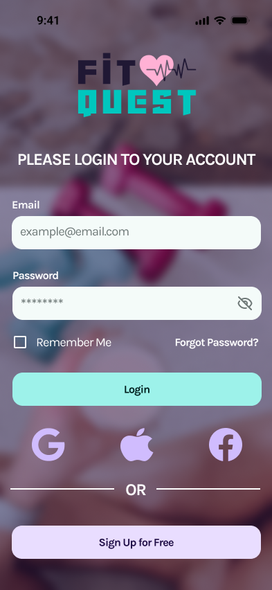
Login
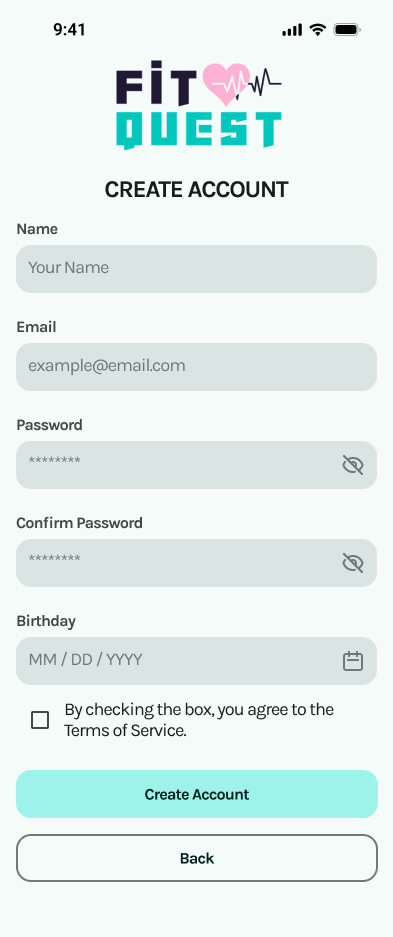
Create Account
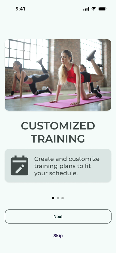
Onboarding
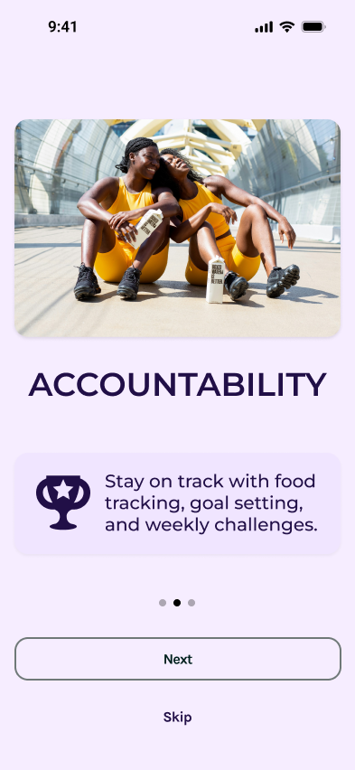
Onboarding
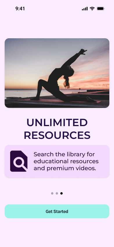
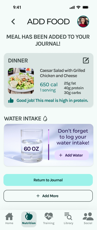
Nutrition Tracking User Flow
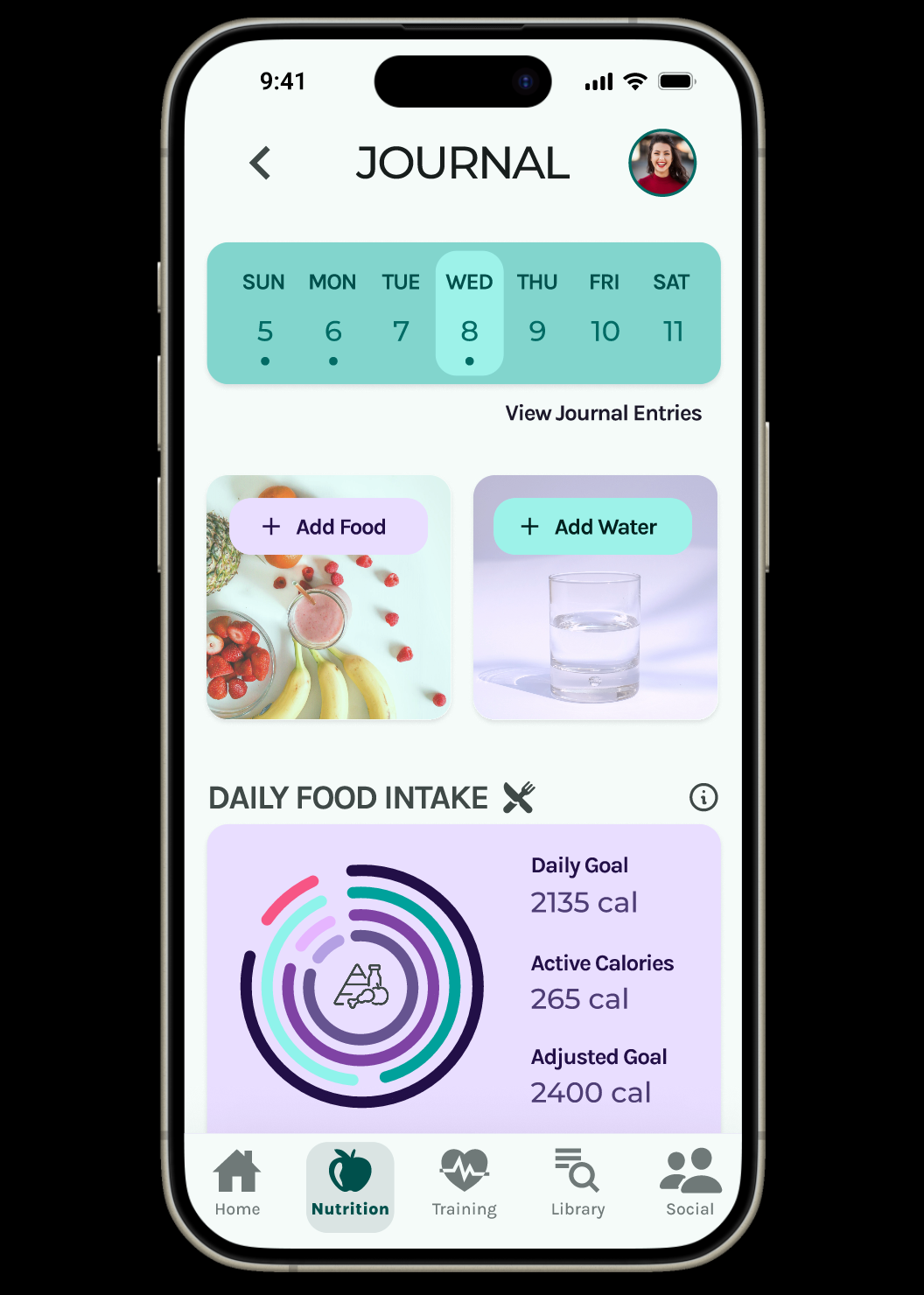
A nutrition journal was added for food logging, and modern features, such as AI technology, were added to keep up with competition.


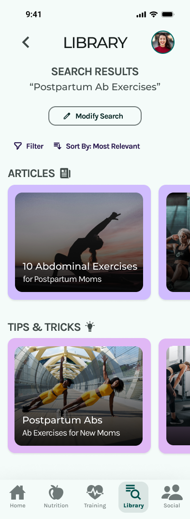
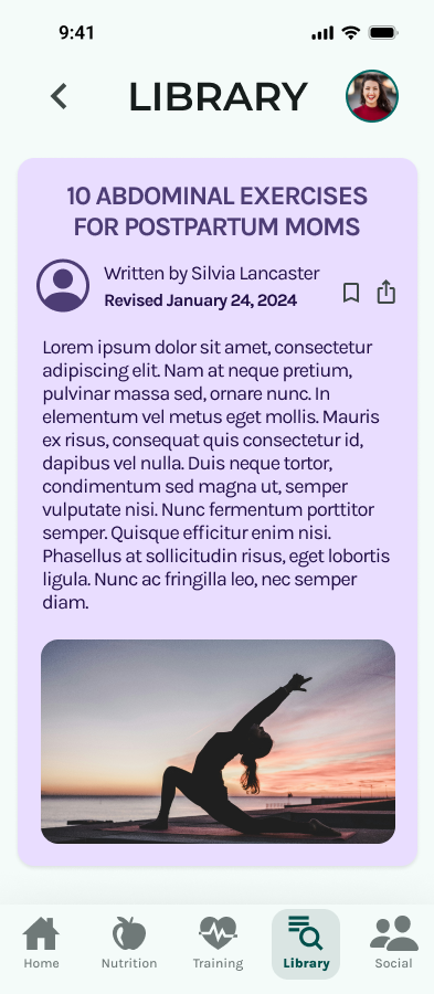
Library Search User Flow
The carousels were redesigned to be consistent with the UI style guide and a Daily Read section was added.

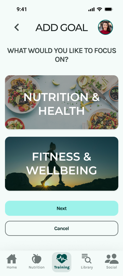
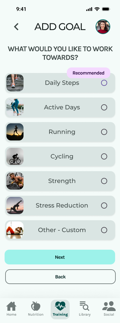
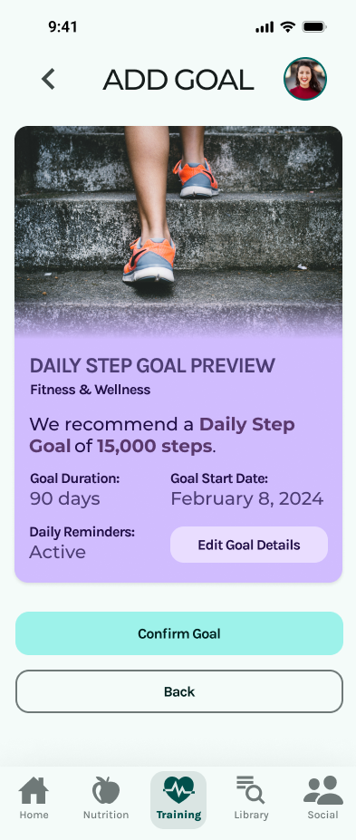
Fitness Goal User Flow
I combined both nutrition goals and fitness goals into one section so that they are easier to find.



The Challenges
Designing an application from scratch comes with its own set of challenges that taught me some lessons along the way. First, patience is important. Designing for humans takes time. You cannot solve problems overnight and that is okay. Second, collaboration is your friend. Continuous feedback loops were necessary so that I could make sure I was creating for others, not myself. And finally, reminding myself that user-centered design is about functionality. It was very hard to keep myself from focusing on visual aspects and making sure everything looked "pretty". User-centered design is an iterative process and its very easy to get caught up in the small details. Making sure I referred to my objectives frequently meant keeping scope creep at bay.
